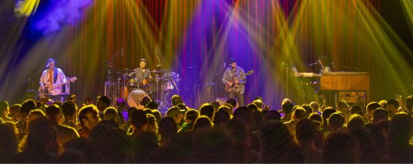
Twitterific 5 is a beautiful looking app and its beauty is accentuated by a wonderful selection of font choices. My favourite of which is Signika because it comes across as professional but light and relaxed enough not to look dull. Amidst all my drooling over Twitterific 5 and Signika, it never occurred to me that it might be a viable font for this site.
Finally I searched around and found Signika in the typeface library of Google Web Fonts. Like Typekit, Google Web Fonts uses a small line of code to implement gorgeous looking typography on websites. I’ve used Typekit since the inception of the site but sadly Signika isn’t in their typeface library.
Google Web Fonts has its fair share of gaudy typefaces but it also has some beautiful gems too. Here are the fonts I’m using now:
Adding fonts to your site is easy. The code is generated for you, simply add it to the <head>…</head> of your site:
<link href="http://fonts.googleapis.com/css?family=PT+Sans+Narrow:400,700|Signika:400,300,600|Inconsolata" rel="stylesheet" type="text/css">
Then you can reference it in CSS like you would any other font. For example:
body, #masthead h1.title {
font-family: Signika, Helvetica, sans-serif;
}
header, article > h3 {
font-family: 'PT Sans Narrow', Helvetica, sans-serif;
}
I store drafts of my articles in Dropbox where my CMS, Second Crack, takes them and creates HTML previews that are also stored in Dropbox. Out of necessity Typekit’s functionality is limited to pages on your domain and can’t add custom fonts to these preview files because they’re either local files or stored on Dropbox’s domain.
Unlike Typekit, Google’s fonts will load on any HTML page allowing my previews to look just like the published article will.
Since Google Reader has been scheduled for termination I don’t trust Google with any of their “products” that aren’t showing or helping to sell ads. Lets just say my yearly subscription to Typekit isn’t going anywhere at the moment.
App.net has become a wonderful community built around conversations and candidness. I encourage you to join and if you do say hello.
As the name App.net implies, it is a platform that connects people via apps. Riposte, though later to the scene than some, is a beautifully designed client that comes across as painstakingly conceived. It is striking at first glance and elegant when in use.
Not Just Any List Of Posts.
App.net is built around a personal stream of posts, much like Twitter’s timeline. Riposte’s main view is simply a list of posts with a small semi-transparent compose button in the bottom right. It’s beautiful but the simplicity isn’t a radical idea, we’ve seen full screen layouts before. Felix, another App.net client, has one. Twitteriffic 5 almost has one. These minimal interfaces may look similar but in daily use Riposte stands above them.
I primarily interact with my iPhone using the thumb of my right hand. There are only two actions that a lone thumb can perform on a touchscreen: swiping and tapping. In the context of the timeline, Riposte’s developers have cleverly mapped these two types of interactions to two outcomes:
- Swiping is for navigation. Horizontal movement is linked to post granularity and vertical movement is linked to recency. As a nice escape mechanism, swiping right will consistently take you back a level.
- Tapping is linked to actions.
For example: to view a post in the context of a conversation, swipe left; to reply, repost, or star a post, tap; to read earlier posts, swipe up; to open links and profiles, tap; to save, share, or export a link, tap and tap again.
Links are the exception to the premise because posts often contain multiple links to profiles and webpages. One tap opens them and a swipe to the right closes them.
Distilling a user’s interactions into these simple terms is brilliant. Interacting with the timeline becomes automatic and one can effortlessly browse conversations without ever getting lost. In other App.net clients swiping may result in different things depending on where you are in the interface. In Riposte users can always be certain of what a tap or swipe will do.
A Thumb At Rest
Hold your iPhone, let it lay naturally in your palm. If your thumb is relaxed and anything like mine it will come to rest just below the exact center of the display1. Without straining or re-adjusting your hand one can efficiently navigate Riposte’s interface with the meagre reach of that single thumb.
Tapping a post in the main timeline will reveal actions that are also also present when you swipe left on a post. After swiping into the detail view, the post is centered on the screen and the action buttons lay perfectly aligned to where your thumb will naturally rest. It’s a minor detail that ensures no grip change is needed to take action.
More Than A Timeline
I mentioned earlier that swiping right will always take you back a level. Swiping right from in the main timeline reveals this menu:
No hamburger icon in fullscreen
Navigation bars are for sissies
The first time I opened Riposte I thought that the order of elements in this drawer was odd. Most menus are ranked by importance, and in this case Settings and Add Account seemed to be valued more than the timeline or mentions. Then, like above, I noticed the position of the more commonly used elements. By placing the more frequently accessed elements at the bottom, the experience is optimized to be used by a thumb that will naturally gravitate towards the bottom of the screen.
The little details add up and aside from typing, Riposte is just as easy to use with one thumb as it two hands.
Mentions and Global Stream
Reading replies in the unified timeline marks them as read in the mentions tab. More apps should do this.
I rarely dip into the Global Stream but I’m glad this is here. Its prominence reminds me that I can always find an interesting conversation.
Interactions
This tab is a nugget of goodness that more apps should emulate. For me it acts as a log of notifications that have disappeared from Notification Center. Lets say two people follow me while I’m AFK and I get two push notifications from Netbot or Felix. I swipe on the first notification and I am taken to the corresponding profile. However, I’ve opened the app so the notification corresponding to the other follower is removed from Notification Center. Now I must dig through my profile to find them. Also, Netbot and Felix don’t show which of my posts people have starred or reposted.
Search
My love of Riposte runs pretty deep but one missing feature stings a little. Timelines aren’t searchable. Even being able to search the interactions tab would help me a lot. Searching for hashtags would be an even greater help when trying to organize the ADN Book Club. Thankfully Twiggy (my second favourite App.net client) and Netbot have great search features that I fall back on in times of need.
Riposte is not fully devoid of search. User Search is available and the scope covers the details of user bios. This is great because I can search for “Riposte” or “Twiggy” and get a nice list of users who have included the username in their profiles. The results give me a great summary of the people involved.
If you’re desperate for hashtag search you can cheat by searching for a hashtag that someone has included in their bio. Tapping on hashtags takes you to a timeline of posts containing the hashtag.
Composing
Like the timeline, Riposte has a standard looking compose screen that masks some amazing shortcuts and features.
Swiping horizontally with one finger on the compose text area will move the cusor one character. Add a second finger to this gesture and you move word by word. This simple interaction makes entering text, editing text, and fitting your thoughts into 256 characters a breeze.
Like the gestures that allow timeline navigation, I have tried swiping on text fields in almost every app I use, I don’t know why it isn’t a built in feature of every iOS text field.
Riposte also comes with a built in url shortener and image hosting service. The link shortener is awesome because it only shortens urls that you want shortened. It’s opt-in nature ensures that writing “App.net” in a post won’t get shortened to a d.pr/… or cl.ly/… unnecessarily.
User name completion is possible but it doesn’t happen inline like many other clients. To insert a name tap @ and start typing. Sadly hashtag support is nonexistent here too.
Adding images to posts couldn’t be simpler. Tap the camera icon, select or take a photo, and then when you finish composing the post your image is added. Images can be uploaded to Img.ly, CloudApp, or through Riposte’s own service2. I really like the way images are shown with Riposte’s service. There isn’t extraneous UI when viewing an image, the webpage is simply a fullscreen image.
Two Finger Gestures
Some less frequent interactions have been mapped to two finger swipes. To switch from light to dark mode, swipe down on a timeline with two fingers. To switch back to light mode just swipe up with two fingers.
I frequently find myself digging through conversations and profiles so that I’m six or seven layers deep. I often want to return to the main timeline but swiping to the right seven times is inconvenient. Instead just use two fingers to swipe to the right.
As I mentioned earlier, swiping with two fingers will move the cursor word by word in the compose area.
Long pressing on a post brings up an action sheet with shortcuts to view who reposted or starred the post. Long pressing on links brings up a useful action sheet. Long pressing on a username shows if they are following you and an options to reply and follow/unfollow.
Notifications
Riposte has push notifications for replies, new followers, reposting, and staring. I’m tired of Tweetbot’s notifications sound in Netbot, Riposte’s notification sounds are a refreshing change. They’re loud and piercing enough to be heard yet not annoying or vulgar.
In app notifications mimic iOS banner notifications by similarly sliding down from the top. If you tap them, a modal window appears. Closing this window takes you back to where you where.
When I’m in a fast paced conversation more replies often come in while I’m typing out my own reply. I hear the sound while I’m typing but there is no in-app notification bar to bring up the modal window over the compose window. You can see the post you’re replying to by scrolling the text field down but I wish there was a way to see newer replies.
Drafts
Another solution, one that I use in Netbot, is to save a draft, close the compose view, and check out my replies. Sadly, Riposte doesn’t have draft functionally yet.
Little Touches
The settings menu is full of minor features and tweaks.
Hiding hop-ons is a neat feature for trimming conversations down to the core group of engaged participants. It removes those single, sometimes off topic, posts that can interrupt the main reply stream. Not to worry, the conversation must meet some prerequisites before posts are pruned. I don’t choose to hide hop-ons, I enjoy (most of) the interjections that App.net offers, though I can see the benefits this feature brings.
When reading links you can use Instapaper or Readability’s mobilizer and send links to the three major Read Later services. You can also disable landscape orientation while web browsing. It’s extremely helpful when browsing links laying down3.
Like any app with a text field worth it’s salt, Riposte has TextExpander support.
For some reason on iOS pixel art becomes a blurry mess. Riposte has a special setting that allows your purposefully pixelated profile picture to look it was intended. I’ll admit it’s a niche feature but it’s also a nice touch for the pixelated pixel junkies out there.
By default Riposte operates without a navigation toolbar at the top of the screen. If your a dotard you can enable the classic UI toolbars but they are negated by the swiping navigation and merely become a waste of space.
Did You Mean Repost?
It turns out Riposte is an actual word:
riposte [ ri-pohst ] n.
a quick, sharp return in speech or action; counterstroke: a brilliant riposte to an insult.
~
Riposte is my favourite App.net client on the App Store. It isn’t as feature rich as other clients, though that may be one of Riposte’s best features.
Screenshots do not do Riposte justice. It’s true beauty is in the way you can glide through the interface like its an extension of your hand. The superficial beauty is just a bonus.
Riposte is available in the App Store for $4.99.